Best Product Analytics Software: Top Picks for PMs (2026)
7 tools reviewedpublished 4 september 2024last reviewed 20 march 2026
Some links on this page are affiliate links. If you sign up via our link we may earn a commission, at no extra cost to you. This doesn't affect which tools we recommend or how we rank them.
Product analytics software tells you what users actually do inside your product, not what they say they do. This page is for product managers, growth teams, and founders who need reliable event tracking, funnel analysis, and retention data to make confident prioritisation calls.
The tools here were selected based on tracking accuracy, depth of behavioural analysis, pricing transparency, and how well they fit different team sizes. You'll find options ranging from generous free tiers to enterprise platforms with session replay and in-app guidance built in.
Each review covers what the tool does well, where it falls short, and who it's actually for — so you can narrow down the list without sitting through six sales demos.
I selected these tools by reviewing product documentation, analysing pricing structures across team sizes, examining user feedback from practitioner communities, and studying output samples including dashboard screenshots and feature changelogs. I focused on tools with clear event-tracking models, transparent pricing pages, and strong coverage across the use cases product managers encounter most often — funnel analysis, retention, and session-level diagnostics. The list spans free options like PostHog to enterprise platforms like Pendo, covering teams from early-stage startups to scaled SaaS businesses.
What is product analytics software?
Product analytics software captures and analyses how users interact with a digital product — which features they use, where they drop off, how long they stay, and whether they come back. It tracks events (clicks, page views, form submissions, custom actions) and surfaces that data in dashboards, funnels, cohort charts, and retention curves.
The core problem it solves is visibility. Without it, product teams are relying on support tickets and gut feel to decide what to build next. With it, you can see exactly where users get stuck, which features drive retention, and whether a recent change helped or hurt engagement.
Product managers, growth analysts, UX researchers, and data teams all use these tools. Some platforms focus purely on quantitative event tracking; others layer in session replay, heatmaps, or in-app surveys to give qualitative context alongside the numbers.
Heatmaps, session recordings, and surveys for understanding page-level behaviour.
UX researchers and PMs investigating page-level friction
FreemiumFree plan available; paid from $32/mo
our top pick
1
Amplitude
Deep behavioural analytics built around the product team's workflow.
Freemium
Best for · Growth-stage SaaS teamsPricing · Free plan available; paid from ~$61/mo
Amplitude centres on event-based tracking with strong funnel, retention, and cohort analysis. Its Insight features use AI to surface anomalies and trends automatically, reducing the time spent digging through dashboards. The free Starter plan covers up to 10,000 monthly tracked users with unlimited data history, which is genuinely useful at early scale.
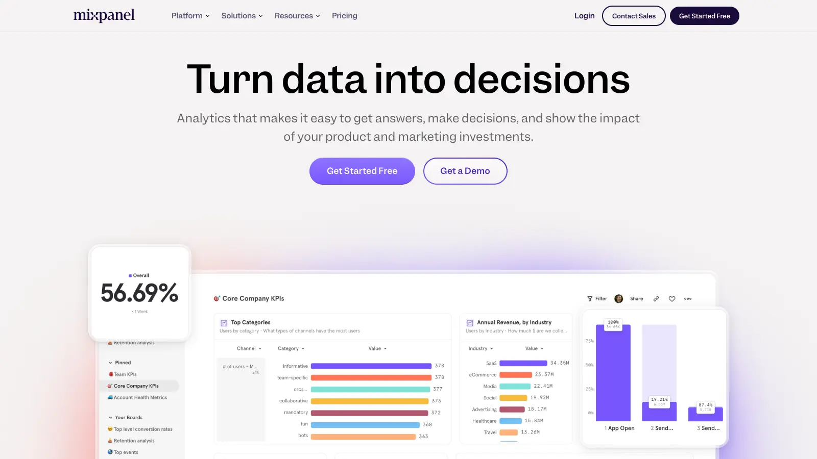
Event-based analytics with fast, self-serve querying for product teams.
Freemium
Best for · Mid-size product and growth teamsPricing · Free plan available; paid from $28/mo
Mixpanel tracks user actions across web and mobile and lets teams build custom reports, funnels, and segmentation without writing SQL. Its free plan allows up to 20 million monthly events, which is one of the most generous in the category. The interface prioritises speed of analysis, with most answers reachable in a few clicks from the main dashboard.
Pros
✓20M monthly events free — generous for most products
✓Intuitive query builder needs no SQL
✓Strong A/B test analysis via Experiments
Cons
✗No native session replay or heatmaps
✗Data model can be confusing when migrating from other tools
Product analytics combined with in-app guidance and user feedback tools.
Freemium
Best for · Enterprise product teams needing analytics and in-app engagementPricing · Free plan available; paid pricing on request
Pendo goes beyond tracking by letting teams create in-app guides, tooltips, and NPS surveys from the same platform. Analytics cover feature usage, session paths, and retention, while the roadmap and feedback modules help close the loop between data and prioritisation. It's a heavier platform than pure-play analytics tools, but the consolidation is valuable for teams that previously juggled separate tools for analytics, onboarding, and feedback.
Pros
✓In-app guides and NPS surveys built in natively
✓Feature-level tagging without SDK changes
✓Free plan covers core analytics for small products
Cons
✗Enterprise pricing is opaque and often expensive
✗Reporting UI has a learning curve compared to Amplitude or Mixpanel
Open-source product analytics with session replay and feature flags in one platform.
Freemium
Best for · Engineering-led teams and privacy-conscious startupsPricing · Free plan available; paid from ~$0 (usage-based above free tier)
PostHog is an open-source platform that combines event analytics, session recording, heatmaps, feature flags, and A/B testing under one roof. Teams can self-host it for full data control or use the cloud version, which has a free tier of 1 million events per month. It's particularly popular with engineering-led product teams who want control over their data pipeline and don't want to stitch together separate tools.
Pros
✓Self-hosting option gives full data ownership
✓Session replay, feature flags, and A/B tests included
✓1M free events/month on cloud plan
Cons
✗UI is less polished than Amplitude or Mixpanel
✗Self-hosted setup requires DevOps time to maintain
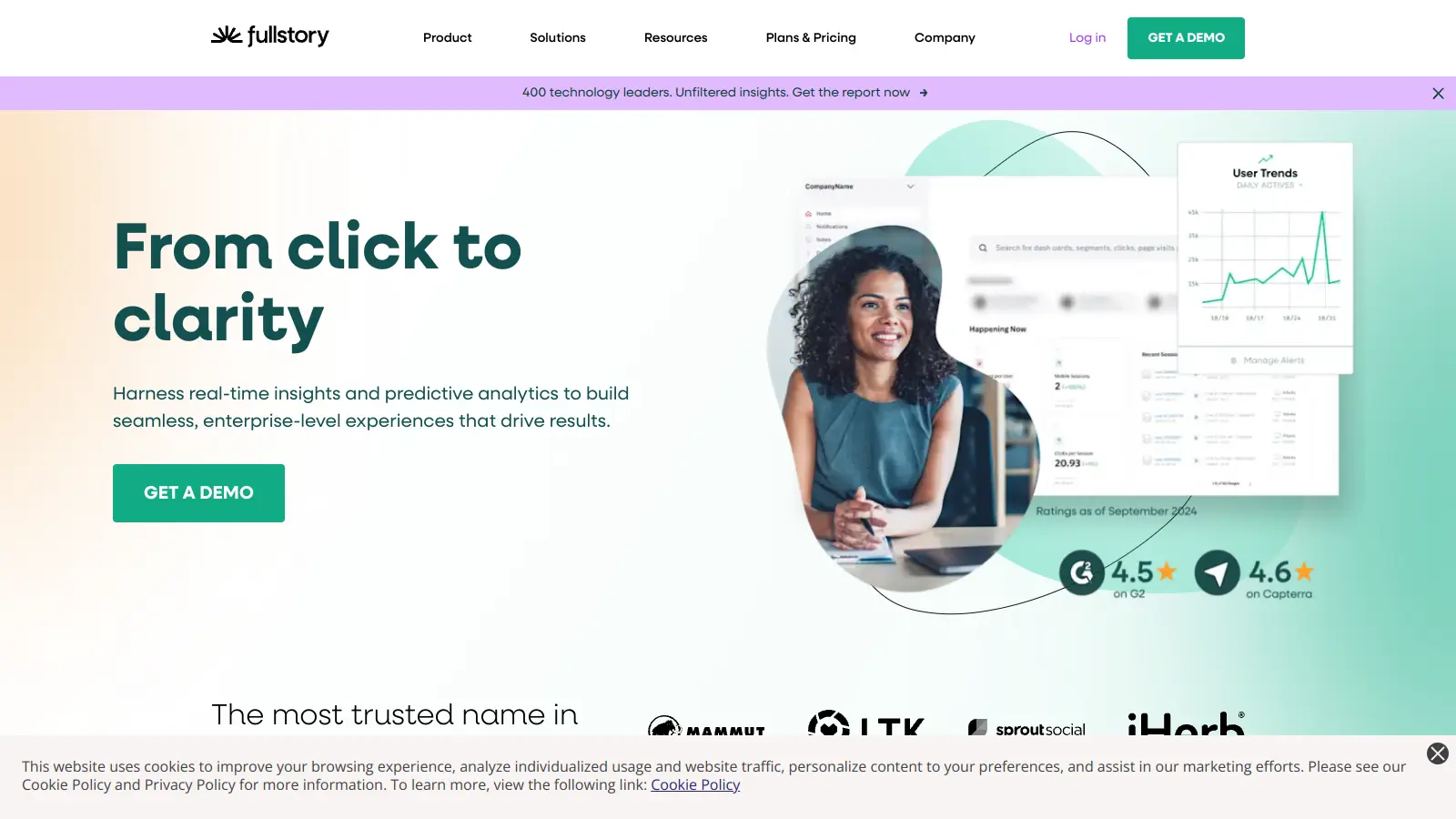
Session replay and behavioural analytics that diagnoses why users drop off.
Custom
Best for · Teams debugging user experience issues at scalePricing · Pricing on request
FullStory records every user session and makes them searchable, so you can watch the exact sessions behind a funnel drop or error spike. It combines quantitative signals (rage clicks, dead clicks, error rates) with full session playback to give engineering and product teams a complete picture of friction. It covers both web and mobile apps and integrates with tools like Salesforce and Segment.
Pros
✓Every session is searchable by behaviour type
✓Rage-click and error detection surfaces issues automatically
✓Strong web and mobile app coverage
Cons
✗No public pricing — requires a sales conversation
✗Less suited to funnel-heavy product analytics workflows
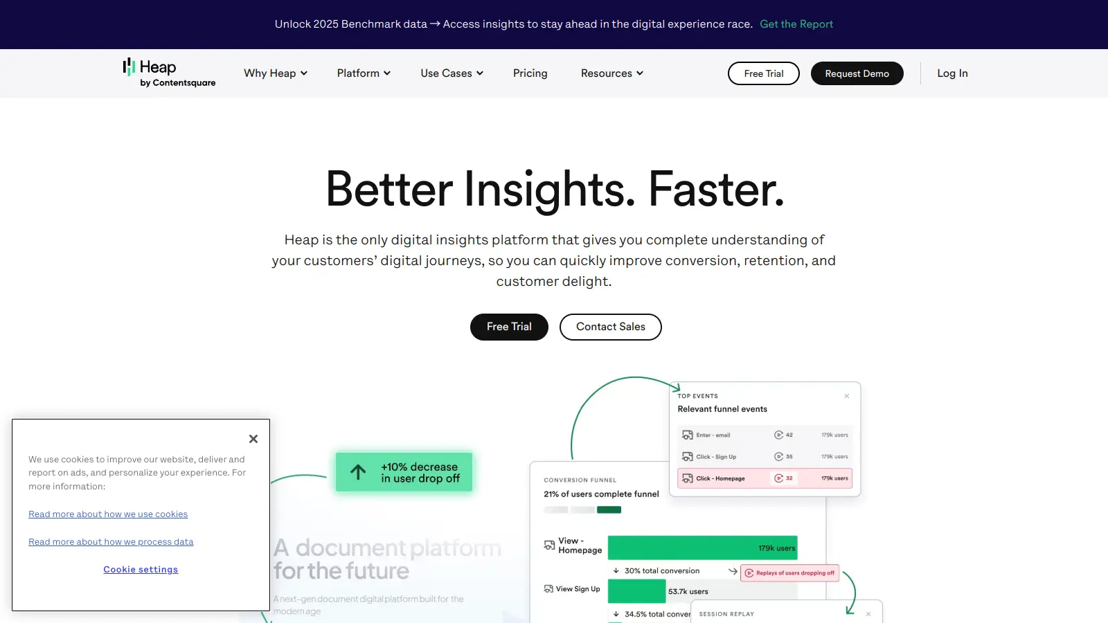
Auto-capture analytics that retroactively queries any past user interaction.
Freemium
Best for · Teams that want retroactive event tracking without re-instrumentingPricing · Free plan available; paid pricing on request
Heap records every user interaction by default, meaning you can define and query events retroactively without needing to re-instrument your product. This is a significant time-saver for teams that haven't built a clean tracking plan yet, or those who want to answer questions they didn't anticipate. Heap also includes funnel analysis, retention charts, and user journey mapping, and its Contentsquare integration adds heatmap and session replay capability.
Pros
✓Retroactive event definition without new code deploys
✓Auto-capture eliminates upfront instrumentation work
✓Journey maps show full user paths across sessions
Cons
✗Enterprise pricing is not published and can be high
✗Auto-capture can produce noisy datasets that need cleanup
Heatmaps, session recordings, and surveys for understanding page-level behaviour.
Freemium
Best for · UX researchers and PMs investigating page-level frictionPricing · Free plan available; paid from $32/mo
Hotjar is a qualitative-first tool that shows where users click, scroll, and move on any given page via heatmaps and recordings. It also has an on-site survey tool for collecting real-time feedback. It's not a replacement for event-based analytics, but it sits alongside tools like Amplitude or Mixpanel to explain the behavioural data they surface. The free plan allows up to 35 daily sessions and unlimited heatmaps.
Pros
✓Heatmaps and recordings are easy to set up and read
✓On-site surveys collect feedback in context
✓Free plan is workable for low-traffic products
Cons
✗No event-based funnel or cohort analysis
✗Session cap on free plan limits diagnostic use for larger sites
Check whether the tool uses auto-capture (records all interactions by default) or requires manual instrumentation via a code snippet or SDK. Auto-capture is faster to set up but can produce noisy data; manual tracking is cleaner but demands engineering time upfront.
Funnel and retention analysis depth
Basic tools show you step-by-step conversion funnels. Better ones let you define conversion windows, compare cohorts, and run retention analyses by feature usage rather than just login date. If retention analysis is central to your work, test whether the tool supports N-day and unbounded retention curves before committing.
Team size and monthly tracked users
Most tools price by monthly tracked users (MTUs) or events per month. A free tier that caps at 10,000 MTUs is fine for early-stage products; a SaaS with 500,000 active users will hit paid tiers fast. Run the numbers against your actual traffic before evaluating features.
Qualitative context alongside quantitative data
Pure event data tells you where users drop off but not why. Tools that combine funnels with session replay or in-app surveys (like FullStory or Pendo) let you watch the specific sessions behind a funnel drop and diagnose the root cause without switching tools.
Data governance and privacy compliance
If your users are in the EU, GDPR compliance is non-negotiable. Some tools store data on EU servers by default; others require configuration or paid add-ons. Check data residency options, PII masking features, and whether the vendor has a signed DPA available before you start tracking.
frequently asked questions
Web analytics tools like Google Analytics focus on traffic sources, pageviews, and sessions. Product analytics tools focus on what users do once they're inside your product — specific feature interactions, in-app funnels, and user-level retention. The distinction matters most for SaaS and app teams who need to track behaviour beyond page visits.
Entry-level plans with meaningful free tiers exist at Amplitude, Mixpanel, and PostHog. Paid plans typically start between $20 and $150 per month for small teams, but scale quickly with monthly tracked users. Enterprise contracts for tools like Pendo or FullStory are priced on request and often run into five figures annually.
For products under 10,000 monthly active users, free tiers at Amplitude or Mixpanel cover the core use cases: funnels, retention charts, and basic segmentation. The main limitation is data history — free plans often cap retention to 90 days or less, which makes long-term cohort analysis difficult as you scale.
Tracking everything without a defined taxonomy. Teams that fire events for every click end up with hundreds of poorly named events that nobody queries. Start with a tracking plan that maps events to specific product questions, and agree on naming conventions before you instrument anything.
Most mid-tier and enterprise tools support data export to warehouses like BigQuery, Snowflake, or Redshift, either natively or via third-party connectors. PostHog and Amplitude both have warehouse sync features. Check whether export is included in your plan tier or costs extra, since some tools charge separately for raw data access.
tools for humans
toolsforhumans editorial team
Reader ratings and community feedback shape every score. Since 2022, ToolsForHumans has helped 600,000+ people find software that holds up after launch. The picks here come from that.